Roll-Up Banners — Design for Three Seconds
A roll-up banner is two metres tall and gets three seconds.
Someone is walking past a stand at a conference, or through a lobby, on their way to somewhere else. They are not going to stop and read. They will glance, from four metres away, at an angle, while talking to someone.
Everything about designing one follows from that.
Why it is harder than it looks
The instinct is to treat it as a poster. It is not — a poster is looked at. A banner is glanced at, and the difference is everything.
It is read at two distances. From across the room, only one element registers: the logo, or a headline, or nothing at all if the design has not decided which. From a metre away, someone who stopped is now reading detail. Those are two different designs sharing one surface, and if you design for either alone the other fails.
The bottom third disappears. People stand in front of it. Furniture blocks it. Anything critical below knee height might as well not exist.
It is printed, and print is unforgiving. What looks right on a backlit screen prints darker and flatter. Colours shift. There is no undo, no revision after launch — you get one file and then a physical object exists.
It has to stand alone. No hover, no click, no next page. Every question a viewer might have is answered here or not at all.
The three
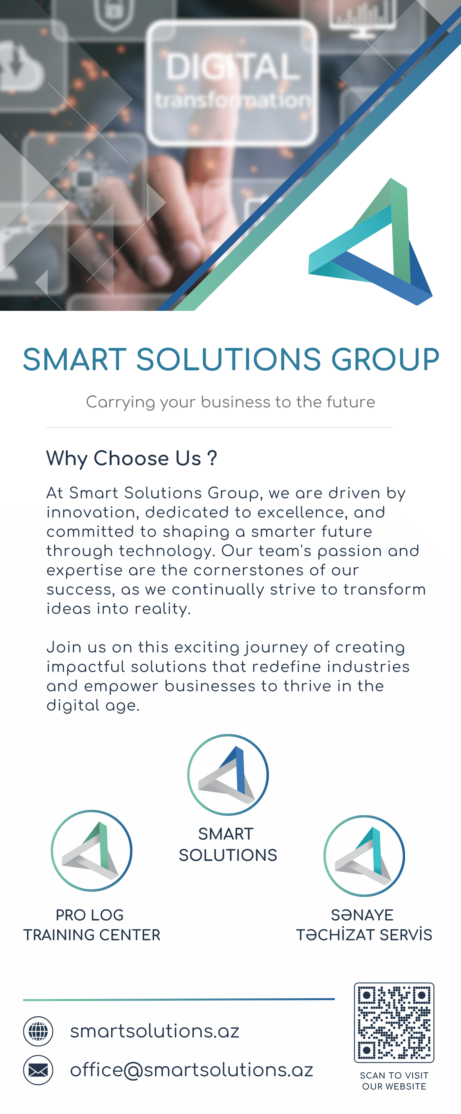
Smart Solutions Group. A corporate banner for an IT company with sub-brands underneath it. The problem: present a parent company and its divisions without the parent disappearing into a list. Solved by hierarchy — the group's identity carries the top, the divisions sit as a considered row rather than competing marks.
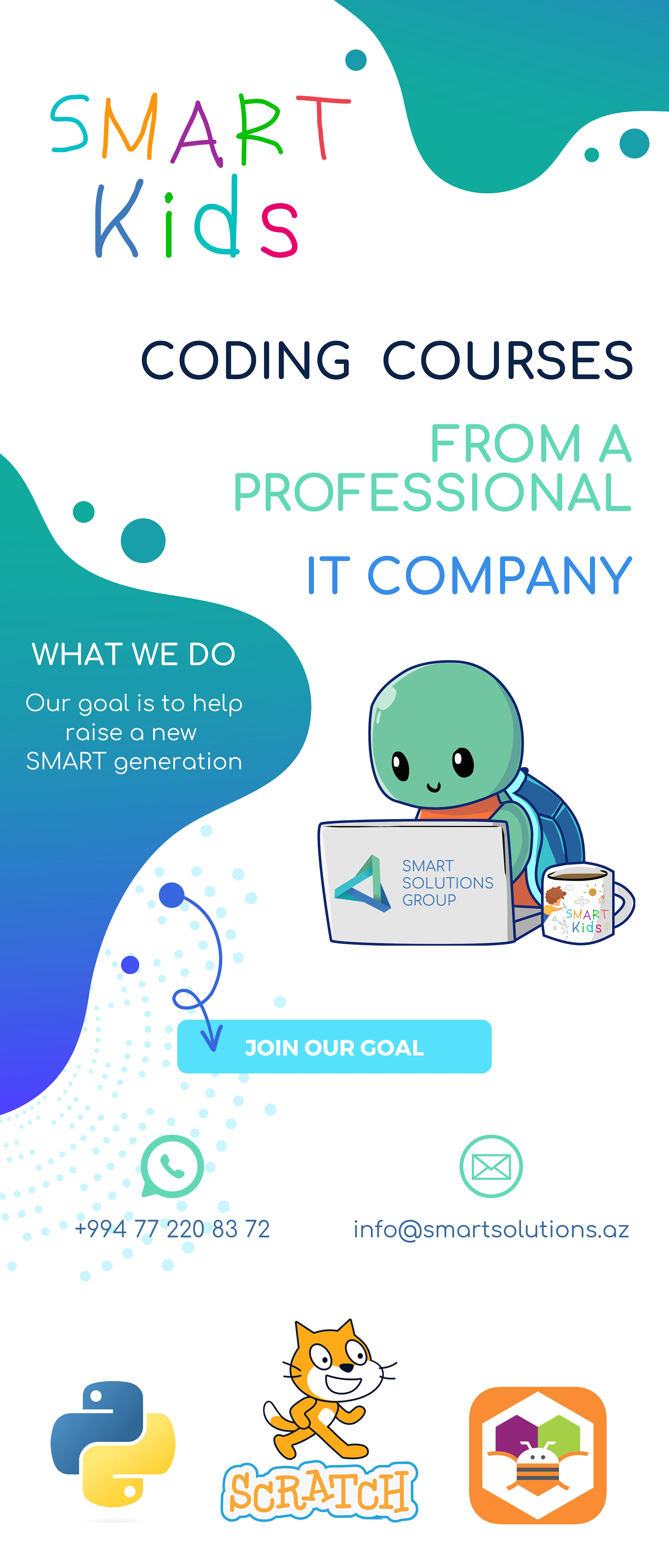
Smart Kids. The same company's coding programme for children. Different audience entirely — this one has to read as approachable from across a room while the parent standing in front of it decides whether the course is serious. It uses the mascot and identity from the full Smart Kids brand system.
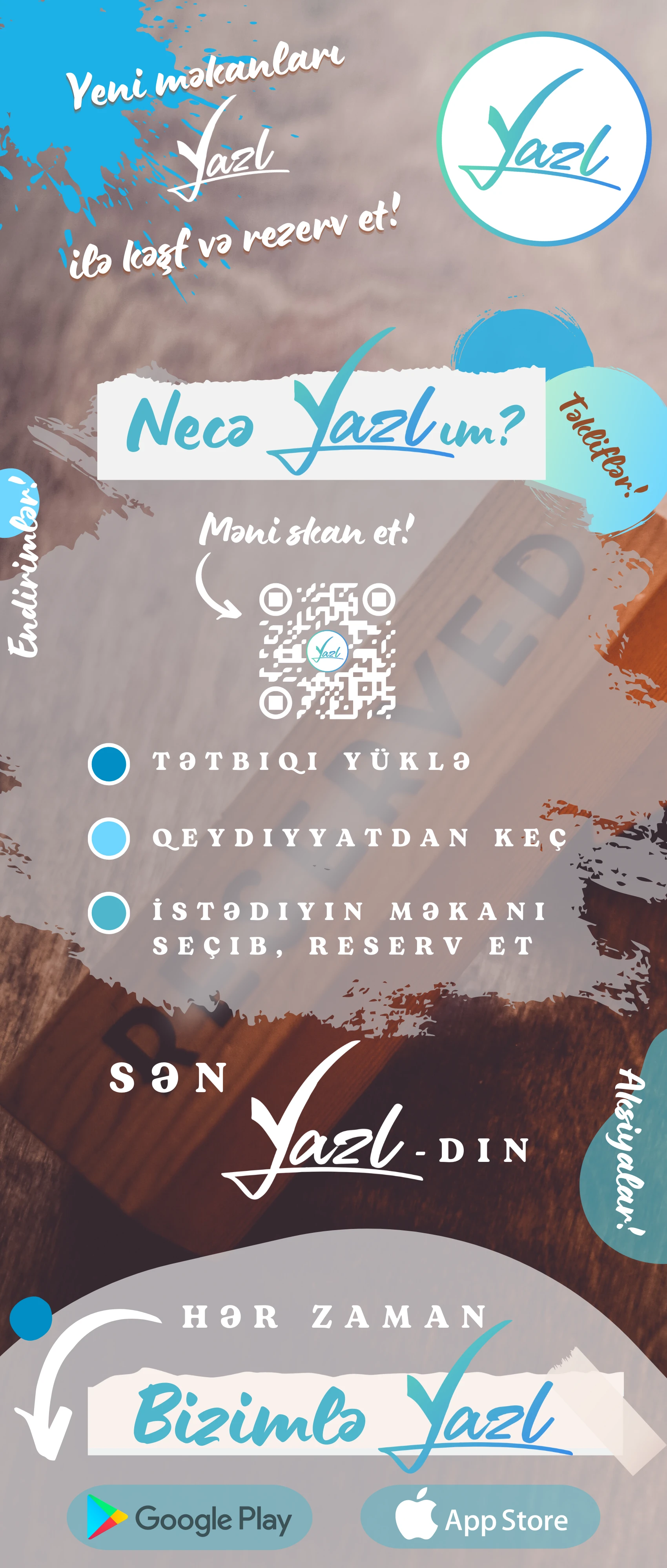
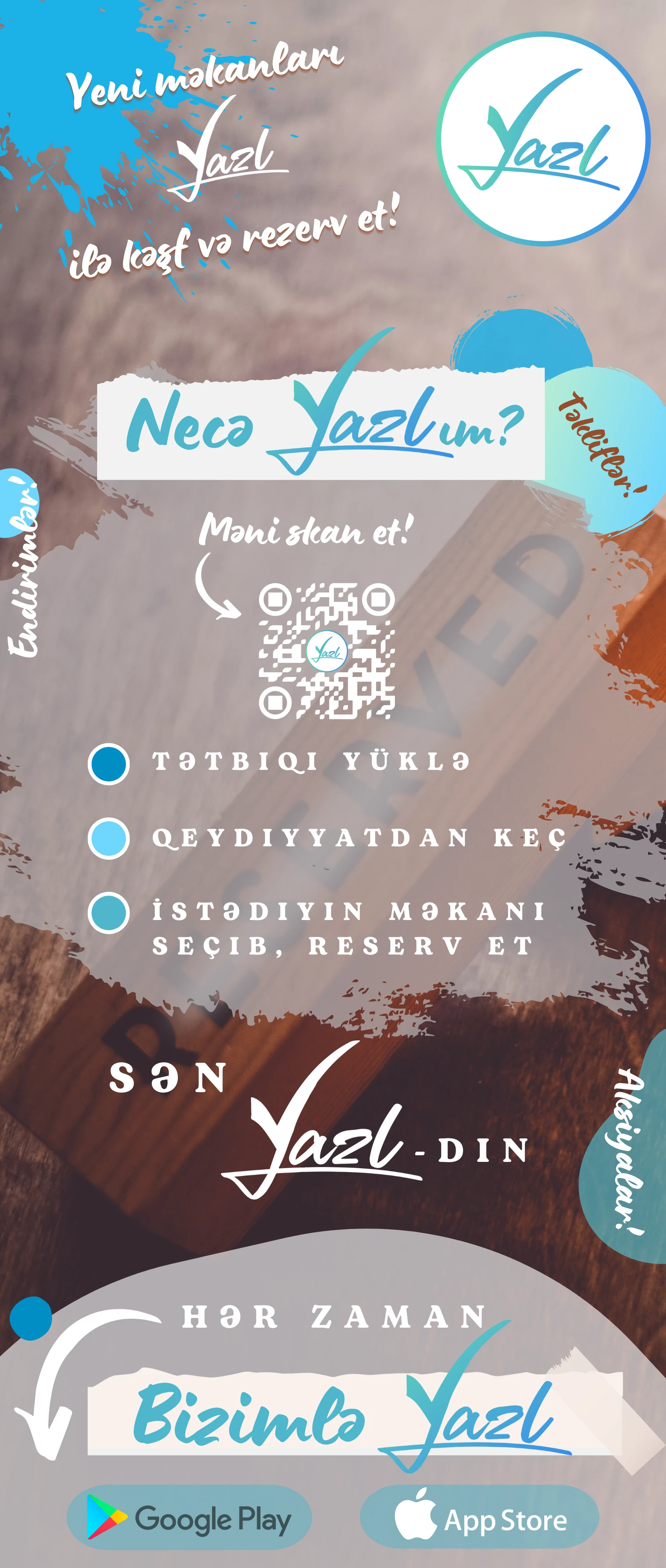
YAZL. A booking startup — cafés, hotels, gyms, venues. Freelance work. A startup banner has a specific problem: nobody knows the name yet, so the banner cannot rely on recognition. It has to explain the product and be memorable in the same three seconds.
What each one has to do
Regardless of the brand:
- One thing readable from four metres. Decide what it is before anything else. If everything is important, nothing is legible.
- A clear top third. That is the part people actually see standing.
- A next step. A URL, a QR code, a person to talk to. A banner that is admired and forgotten did nothing.
- Print-correct colour. Specified for print, not eyedropped from a screen.
- Room to breathe. The instinct is to fill two metres. The result is a wall of text nobody reads. Empty space is what makes the one important thing important.
Why this is not a small job
Print design gets treated as the cheap end of design work — a logo dropped onto a template, an afternoon's work.
But a banner is the most exposed thing a brand produces. It stands at full height, in a room full of competitors doing the same thing, and it is judged before anyone has read a word. It is also permanent in a way nothing digital is: a website with a mistake gets fixed in ten minutes. A printed banner with a mistake stands in your lobby for two years.
Which is part of why a brand is a system rather than a drawing — the logo has to have been designed for this before anyone opens the banner file.
Designed by Lali Bagrationi. Now Project Manager and Designer at DAKER.