Smart Kids — Brand Identity for a Coding School
The problem
This brand has to persuade two people who want opposite things.
The child decides whether this looks like something they want to do. If it reads as school, as homework, as another thing adults have arranged for them, they are out before the first lesson. Children are not diplomatic about this.
The parent decides whether to pay for it. They are asking whether these people are serious, whether their child will actually learn something, and whether an IT company running a kids' programme is a real education provider or a marketing exercise.
Design that wins the child usually loses the parent — cartoon fun reads as unserious. Design that wins the parent usually loses the child — corporate blue reads as school. Most brands in this category pick one and quietly fail with the other.
The second constraint: it sits under Smart Solutions Group, a professional IT company. The child-facing brand cannot contradict the parent brand, and it cannot be swallowed by it either.
What was designed
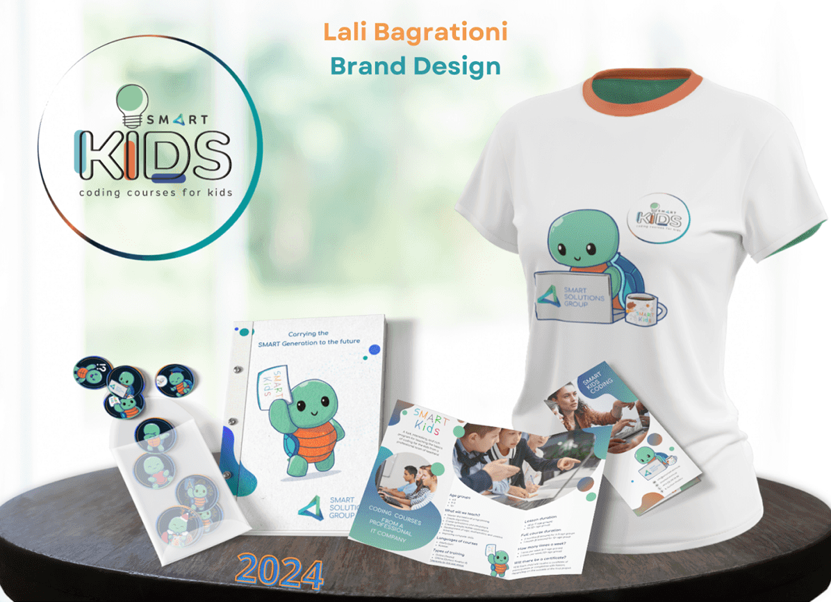
Logo and identity. The Smart Kids mark, built around a lightbulb and typography that reads as playful without becoming childish. It works in the circular badge, on a t-shirt, on a sticker the size of a coin, and beside the Smart Solutions Group logo without either one losing.
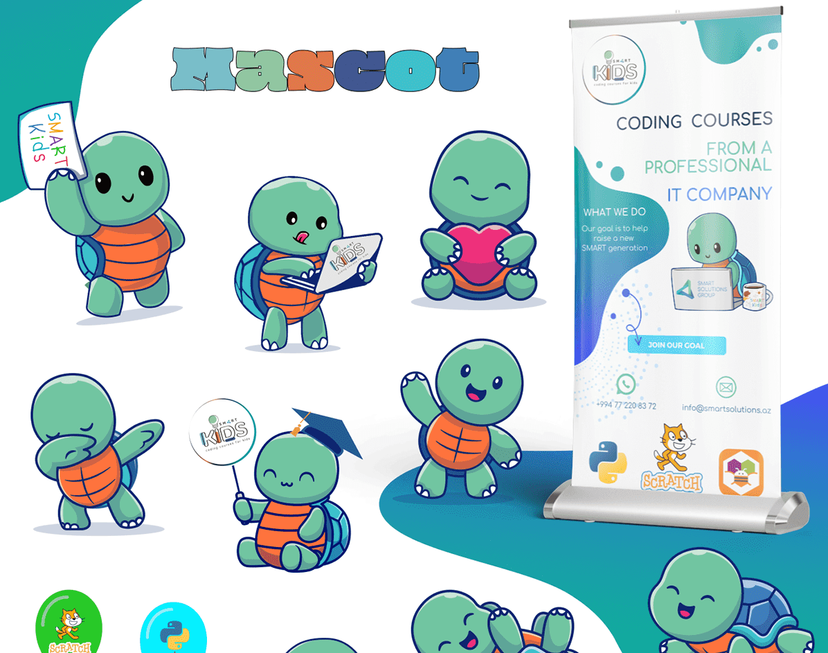
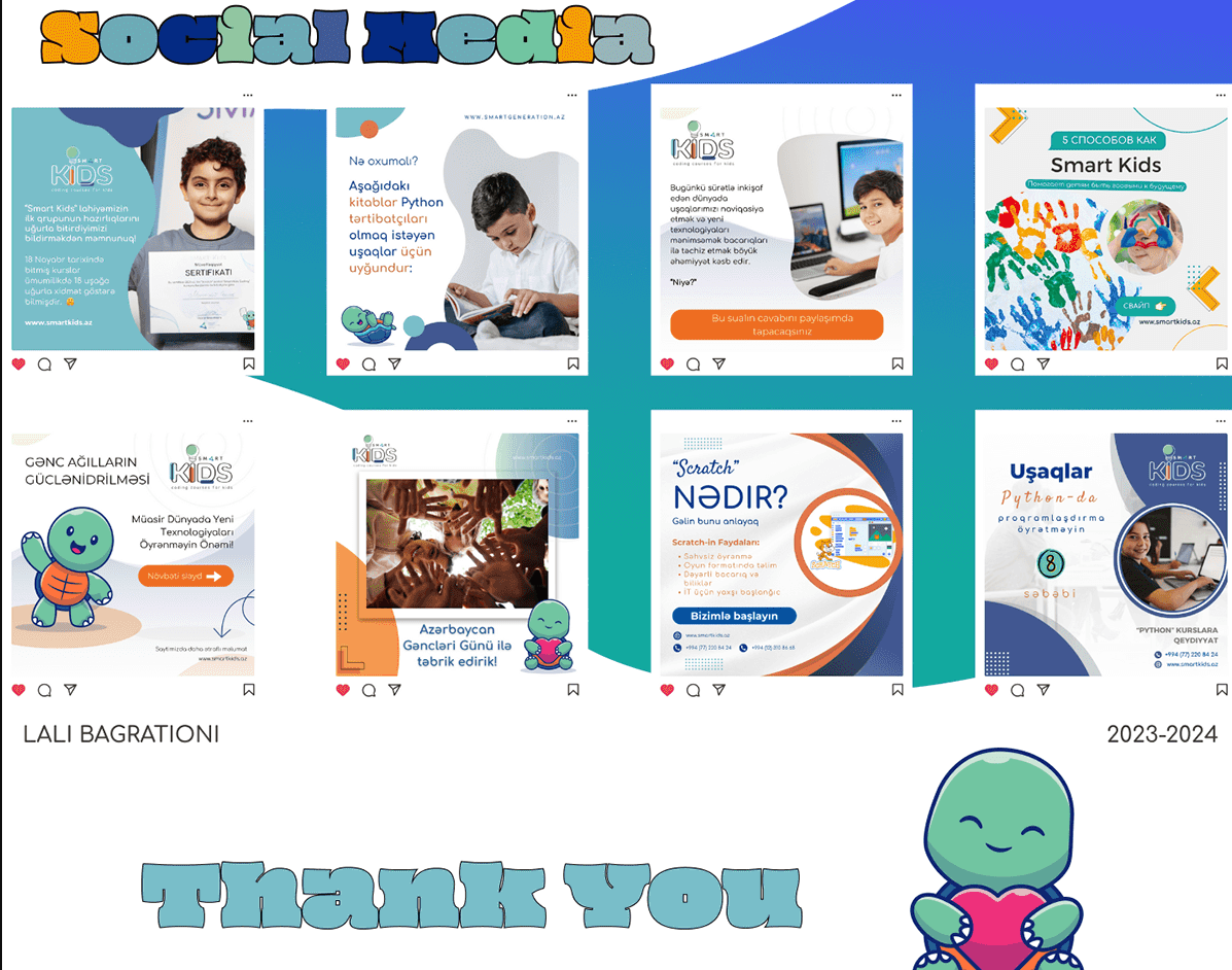
The mascot. A turtle, with a laptop and a backpack. This is what carries the brand — it appears on the brand book, the merchandise, the stickers, the flyers, and it does the work of speaking to children while the typography and colour palette speak to parents. One character, doing the thing the logo alone cannot do.
Full brand book. Not a logo file — a system. Colour, typography, mascot usage, layout rules, and how all of it behaves across materials, so people who are not designers can produce something consistent without asking.
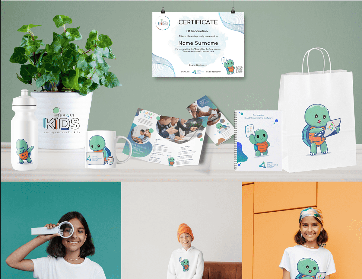
Print materials. Flyers, brochures, roll-ups — presenting course structure, age groups, lesson duration, and certification to parents making a decision.
Merchandise. T-shirts, stickers, badges. The part children actually want.
Certificates. The artefact a child takes home and a parent puts on a wall — the physical proof the programme was real.
Why the mascot is the whole answer
The turtle solves the two-audience problem that the logo could not.
A logo has to work on a certificate and a business card. It cannot be a cartoon. So it stays measured, and it speaks to the parent — which leaves the child unaddressed.
The mascot takes that job. It goes where children look — the sticker, the shirt, the badge, the corner of the flyer — while the typography and structure carry the credibility for the adult reading the same flyer. Same brand, two registers, no compromise in either direction.
That is the difference between designing a logo and designing a brand. A logo is one drawing that has to work everywhere. A brand is a system where different pieces do different jobs, and someone has decided in advance which piece does which.
Result
A complete identity that works from a coin-sized sticker to a roll-up banner, sits under a corporate parent brand without conflict, and speaks to a nine-year-old and their mother in the same flyer.
**Designed by Lali Bagrationi. ** A note on this project: this is the work of Lali Bagrationi, our designer, produced while she was working at another studio. It is published here as an example of her work, with permission — not as a DAKER client project.
We are showing it because it is the clearest demonstration of what she does, and because you should know who is designing your brand before you hire anyone to do it.