Pets Universe — Landing Page Concept
The premise: an app for pet owners. Find care information, book vet consultations, keep a health diary for your animal.
Three features. One page. A stranger who has eight seconds.
The problem the concept sets out to solve
A landing page for a multi-feature app has a specific failure mode, and almost every one of them falls into it.
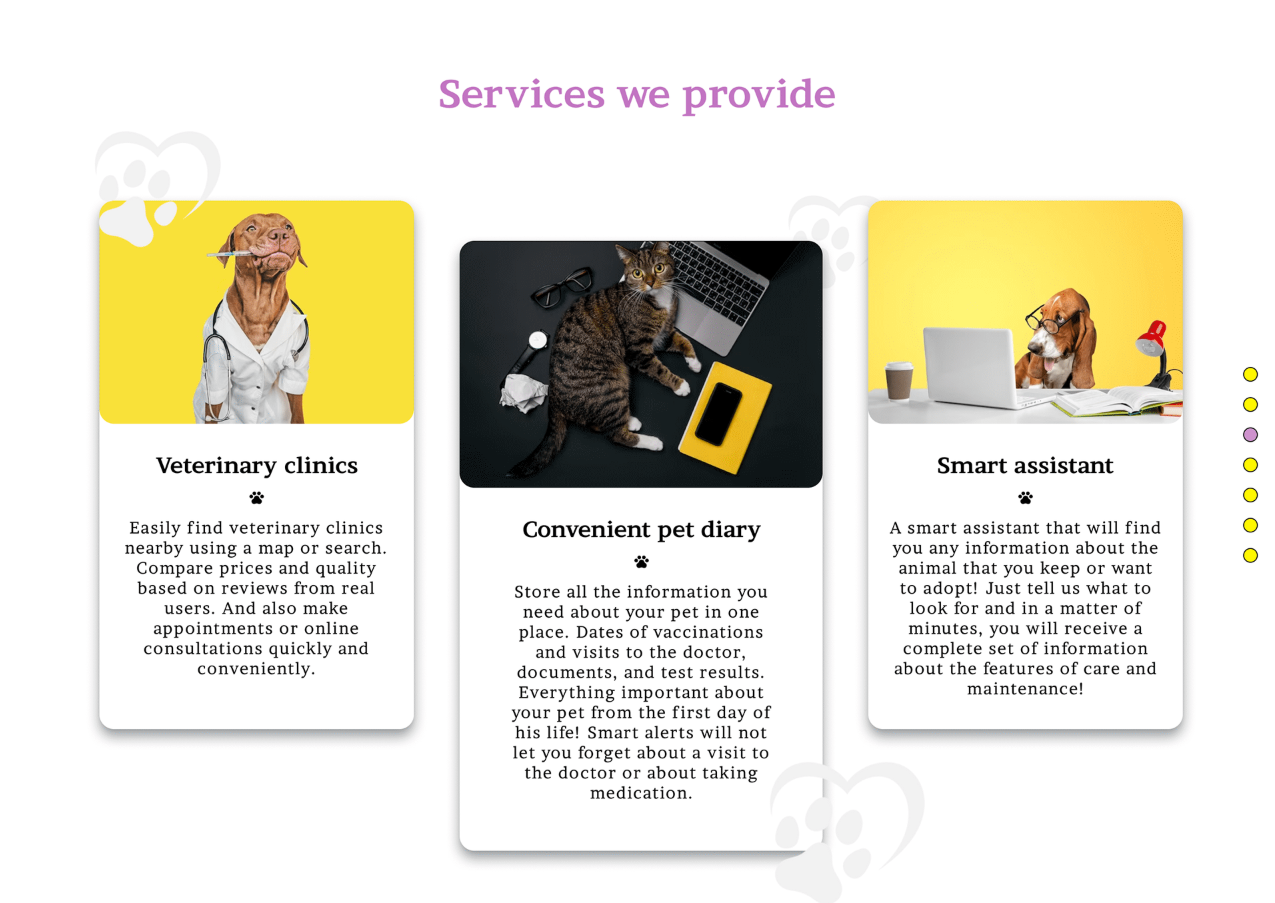
The product does three things. So the page says it does three things — a list, evenly weighted, each explained. And the visitor reads a list, understands nothing about why they would want it, and leaves. Not because the features are bad, but because a list is not an argument. It is an inventory.
The second problem is who this person is. They are not evaluating software. They are a person who loves an animal, and somewhere in the back of their mind is a low-grade worry: am I doing this right, did I miss a vaccination, is that limp anything. That is the actual state they arrive in, and a page that addresses them as a software buyer misses them entirely.
What the concept works out
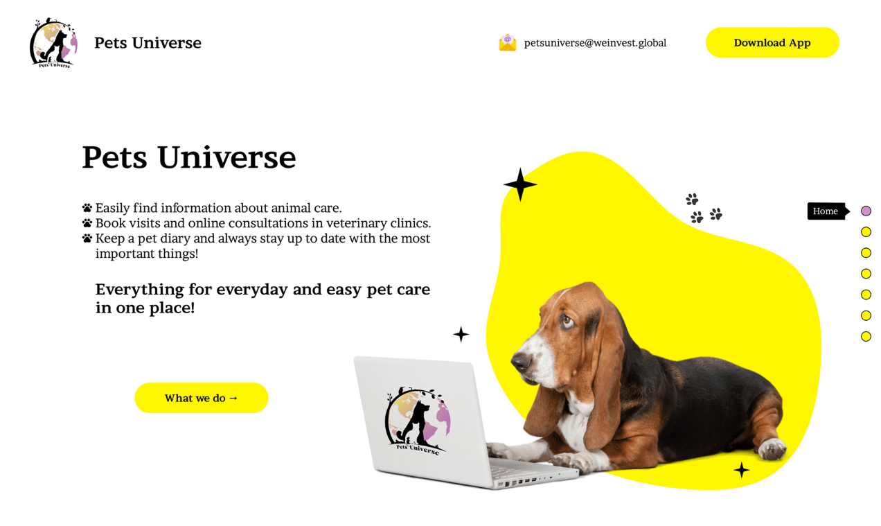
One promise above the features. The three capabilities are listed — but underneath them sits the line that actually does the selling: everything for everyday pet care, in one place. That is the argument. The list is the evidence for it. Getting that order right is most of the difference between a page that converts and a page that informs.
A tone that matches the subject. Yellow, a dog at a laptop, paw prints. This is a page about someone's pet, and a serious corporate treatment would be a category error — it would be technically competent and emotionally wrong. Warmth here is not decoration, it is accuracy.
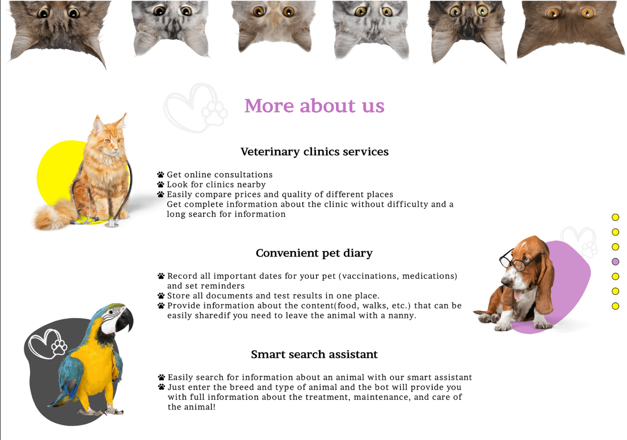
Photography of actual animals. Real dogs, in real rooms, on real sofas. The single most persuasive element on a page like this, and the one most often replaced with an illustration because an illustration is easier to art-direct.
One primary action. Download the app, in the header and repeated where it makes sense. The secondary route — "What we do" — leads down the page rather than away from it, which means the page has one destination and one path toward it.
Features explained by outcome, not function. The diary is not "record important dates" — it is not forgetting a vaccination, and having everything in one place when you leave your animal with someone else. The clinic search is not "compare prices" — it is knowing what you are about to pay before you are in the waiting room. Same features, different sentence, entirely different page.
Why the emotional register is the whole answer
The temptation on a product landing page is to be clear and neutral. Clarity is good. Neutrality is the mistake.
Someone deciding whether to install a pet care app is not making a rational software decision. They are responding to a feeling — the small persistent anxiety of being responsible for a creature that cannot tell you what is wrong. The page that acknowledges that converts. The page that lists features to the same person is competing on the wrong axis and losing to one that costs less.
That is not a design flourish. It is the difference between a page that gets traffic and a page that gets installs. Which is a problem that shows up on almost every website we are asked to fix — the site is clear, correct, and speaking to nobody in particular.
Why concept work is worth showing
A client project is shaped by budget, deadline, and someone's opinion. That is the job, and most of our portfolio is exactly that.
But it means what you see is partly a record of what was possible rather than what was right. Concept work strips that away, and what is left is the reasoning: what the designer thinks matters, what they cut, and what they will not compromise when nobody is making them.
That is what you are hiring. It is worth being able to see it.
Designed by Lali Bagrationi. Now Project Manager and Designer at DAKER.