Biflora — Mobile App UX/UI Concept
Biflora is a flower and gift delivery marketplace for the Arab market. Two apps: one for customers, one for the vendors selling through it.
The problem the concept sets out to solve
Flower delivery is a strange product to sell through a screen.
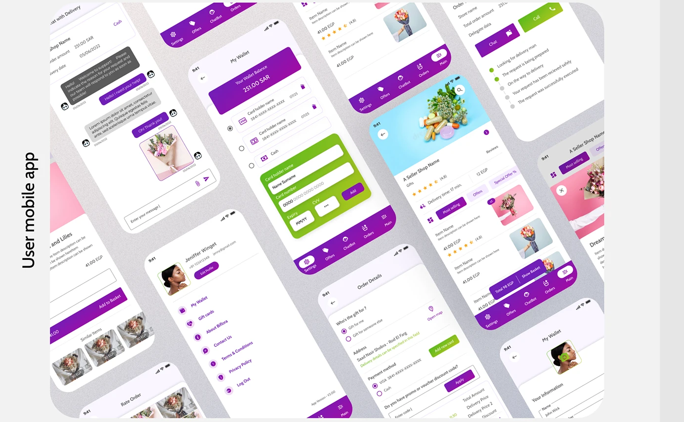
The buyer will never see what they are buying. They order a bouquet in Cairo, it is assembled by a florist they have never met, and delivered to someone else entirely. The buyer's only experience of the product is the moment their sister sends a photo — or does not.
That inverts everything a normal marketplace optimises for. There is no unboxing, no arrival, no confirmation that you got what you paid for. What you are actually buying is confidence: that the thing in the photograph is the thing that will arrive, at a house you are not at, on a day that matters.
What the concept works out
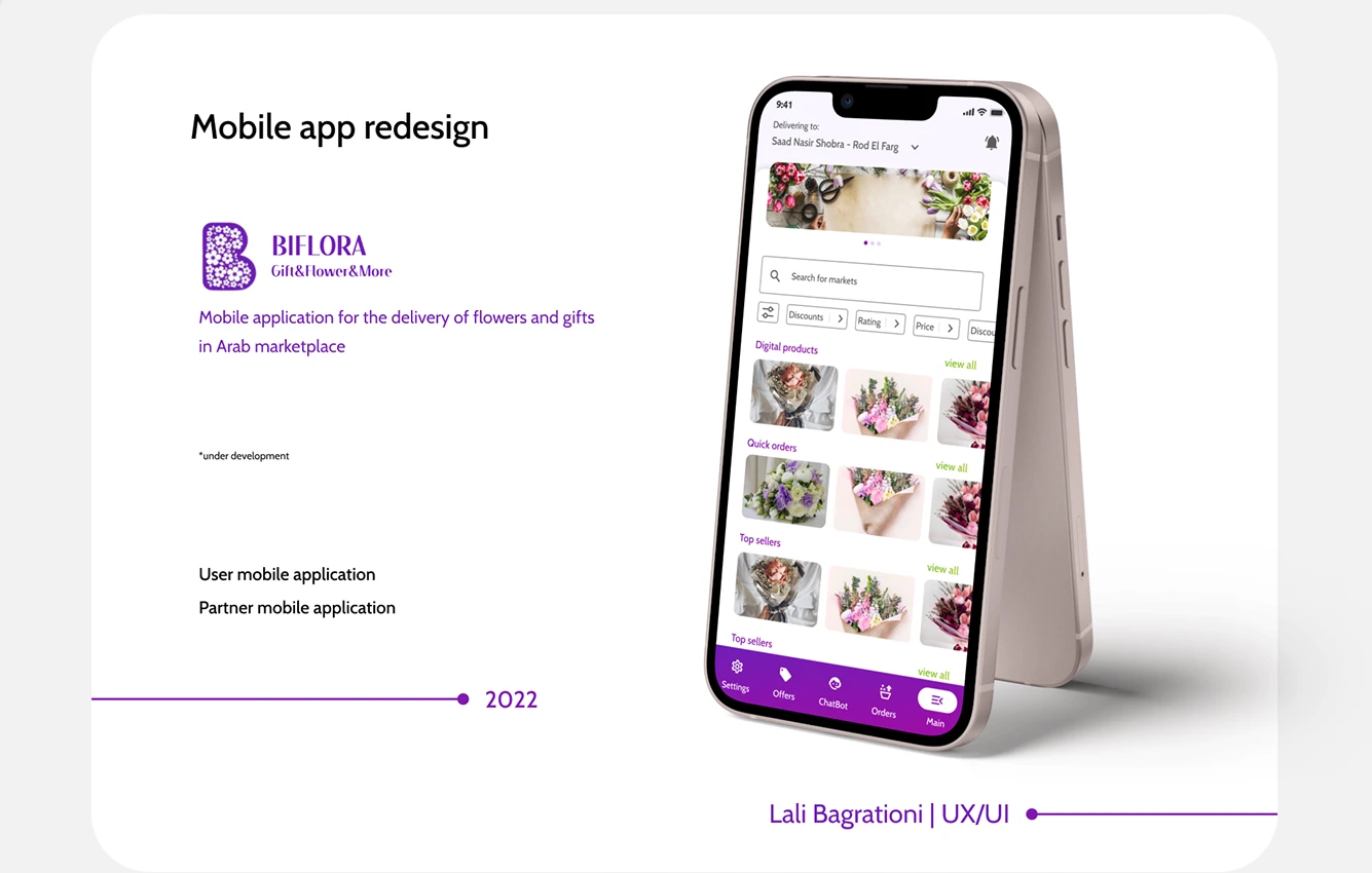
Photography as the entire product. The home screen is built around images at a size where the arrangements can be judged. Everything else — search, filters, navigation — is arranged to not compete with them. In this category the picture is the specification, and shrinking it to fit more of the interface on screen is a decision to sell less.
A marketplace, not a shop. Multiple vendors, one app. That means search that works across sellers, and filters — discounts, rating, price — sitting where a hesitant buyer can reach them without leaving the flow. Rating is not a nice-to-have here; when the buyer cannot see the product, the only available proof is other people.
Structure for two kinds of buyer. Digital products, quick orders, and top sellers as separate rails, because two different people arrive at this app: the one who knows exactly what they want and needs it gone in ninety seconds, and the one who is browsing to decide. One layout, two paths, neither getting in the other's way.
Delivery address at the top, always visible. The most consequential field in the entire product, and the one most likely to be wrong — because the buyer is entering someone else's address. It sits above everything, permanently, rather than being confirmed once at checkout and forgotten.
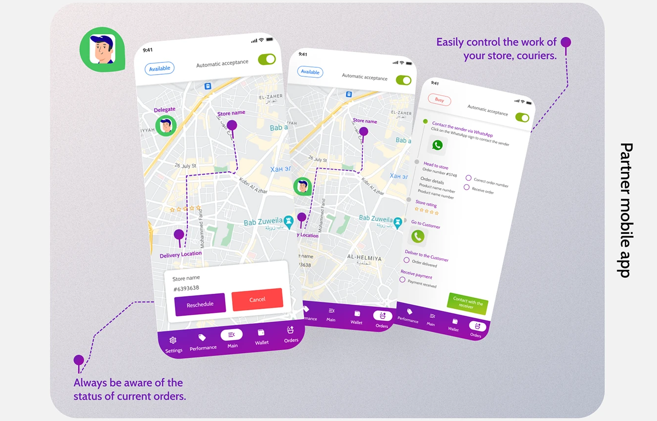
A vendor app, designed separately. The customer app exists to make choosing feel considered. The vendor app exists to make working fast. Same marketplace, opposite goals — a florist processing eleven orders on a Friday afternoon does not want a beautiful browsing experience, they want the next order and the address.
Why concept work is worth showing
A client project is shaped by a budget, a deadline, and someone's opinion. That is fine — that is the job, and most of our portfolio is exactly that.
But it means the finished thing is always partly a record of what was possible rather than what was right. Concept work removes that. What is left is the designer's actual reasoning: what they think matters, what they cut, and what they refuse to compromise when nobody is making them.
That is the thing you are hiring. It is worth being able to see it.
Designed by Lali Bagrationi. Now Project Manager and Designer at DAKER.