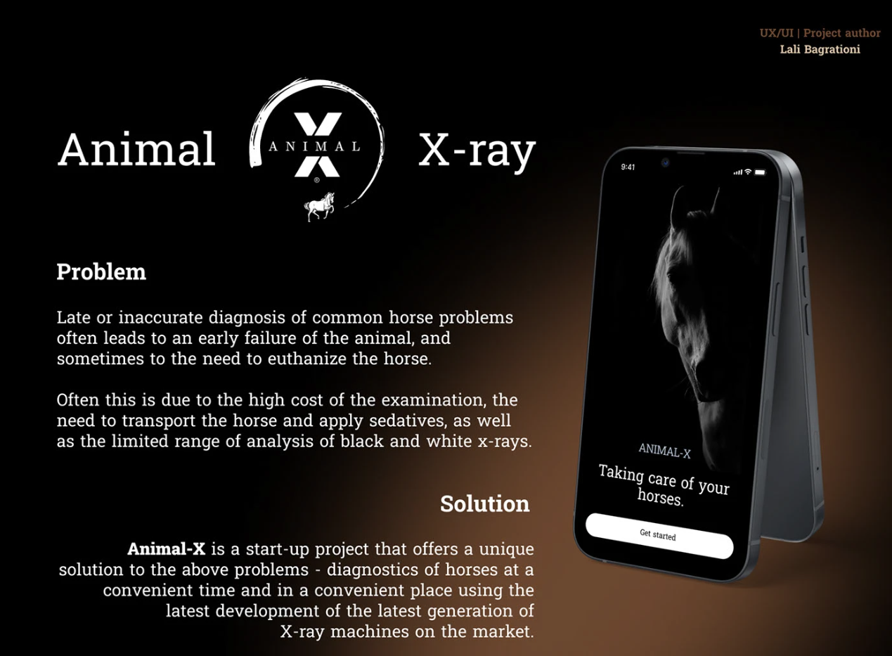
Animal-X — Veterinary X-Ray Service App Concept
The premise: mobile X-ray diagnostics for horses.
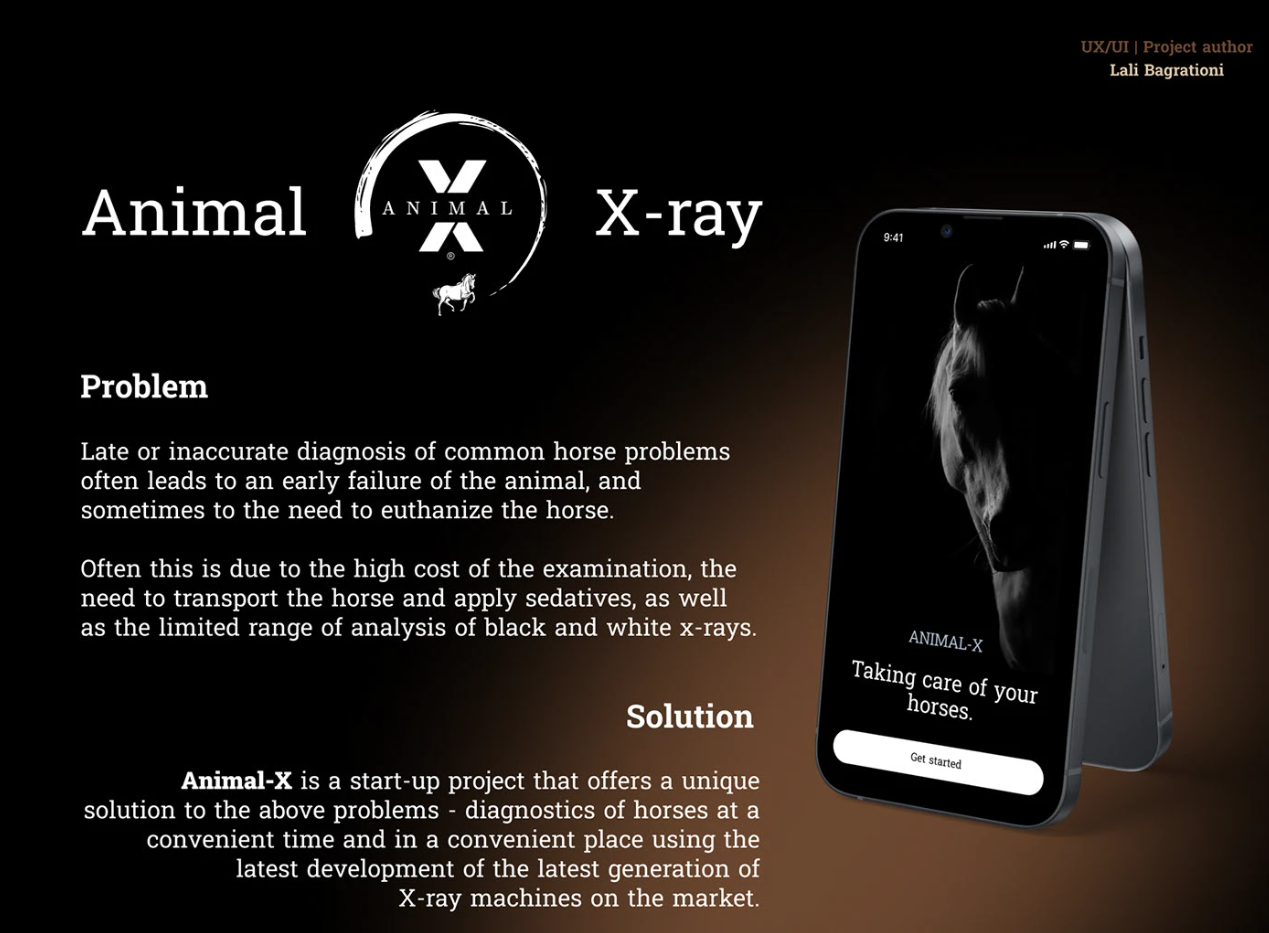
A horse develops a problem. Diagnosing it early is the difference between treatment and, sometimes, euthanasia. But examination is expensive, the horse has to be transported, sedatives are involved, and conventional black-and-white x-rays only reveal so much. So diagnosis gets delayed — not through negligence, but because every step is a barrier.
The service removes the barriers: modern equipment, brought to the horse, at a time the owner chooses.
The design problem is what happens next.
The problem the concept sets out to solve
This is not an app anyone wants to open.
A flower app is opened because something nice is happening. This one is opened because an animal worth a great deal of money, that someone has known for fifteen years, is not walking right. The user is worried, possibly in a stable, possibly at six in the morning, and every second of confusion is a second longer they are frightened.
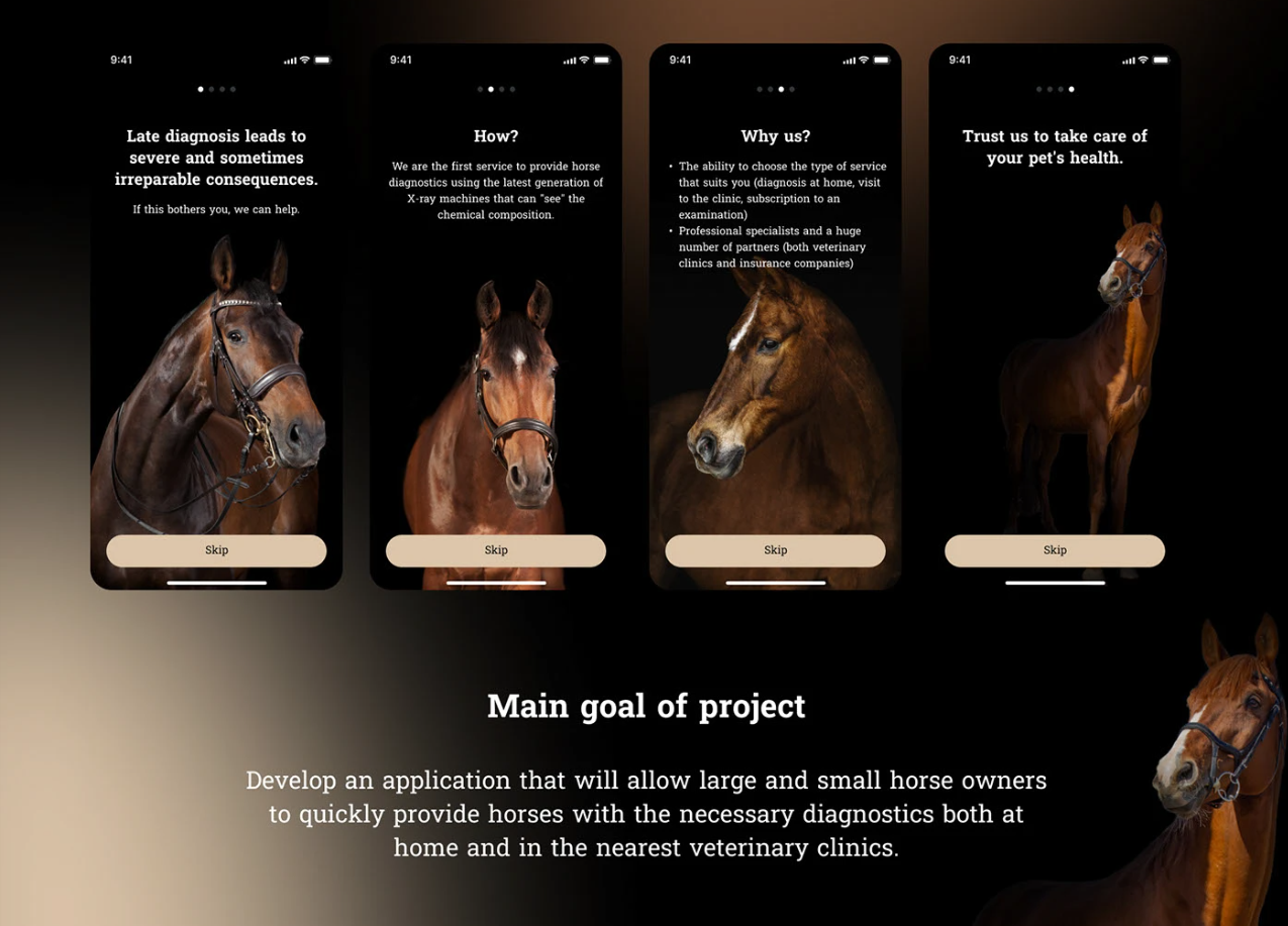
That rules out most of what makes apps pleasant. No onboarding tour, no discovery, no clever navigation to learn. The interface has one job: get this person from worry to a booked appointment without making them think.
The second problem is subtler. The service has three completely different buyers, and they arrive in the same app:
- The emergency. Something is wrong now. They want someone here, today.
- The cautious. Nothing is wrong, but they want a professional to look. They will consider a clinic appointment.
- The professional. Multiple horses, ongoing. For them this is not an event, it is maintenance. Build for the emergency and the professional finds it tedious. Build for the professional and the panicked owner is lost in a subscription flow. Most products in this position pick one and quietly fail the others.
What the concept works out
Three routes, chosen in one screen. Diagnostics at home, appointment at a partner clinic, or a subscription. Presented as three equal choices with a photograph and one line each — because the user already knows which of the three they are. They do not need to be guided to the answer, they need to be shown the door.
Home diagnostics: fewest fields possible. Number of horses, address, contact number. That is it. Everything else the service needs can be established on the phone or on arrival. The form is short because the person filling it in is not in a state to fill in a long one.
Price shown before the button. The breakdown is on the screen — diagnostics, the specialist's visit, the total — with a plain note that the final amount may vary by case. In a category where cost is the reason people delay, hiding the number until checkout is not a conversion tactic, it is the thing that made the problem exist in the first place.
Subscription, built as a calculator. Months, visits per month, number of horses — three sliders, and the price updates. This is the professional's screen. They are not being sold to; they are working out whether the maths is favourable, and the fastest way to sell to that person is to let them do the sum themselves.
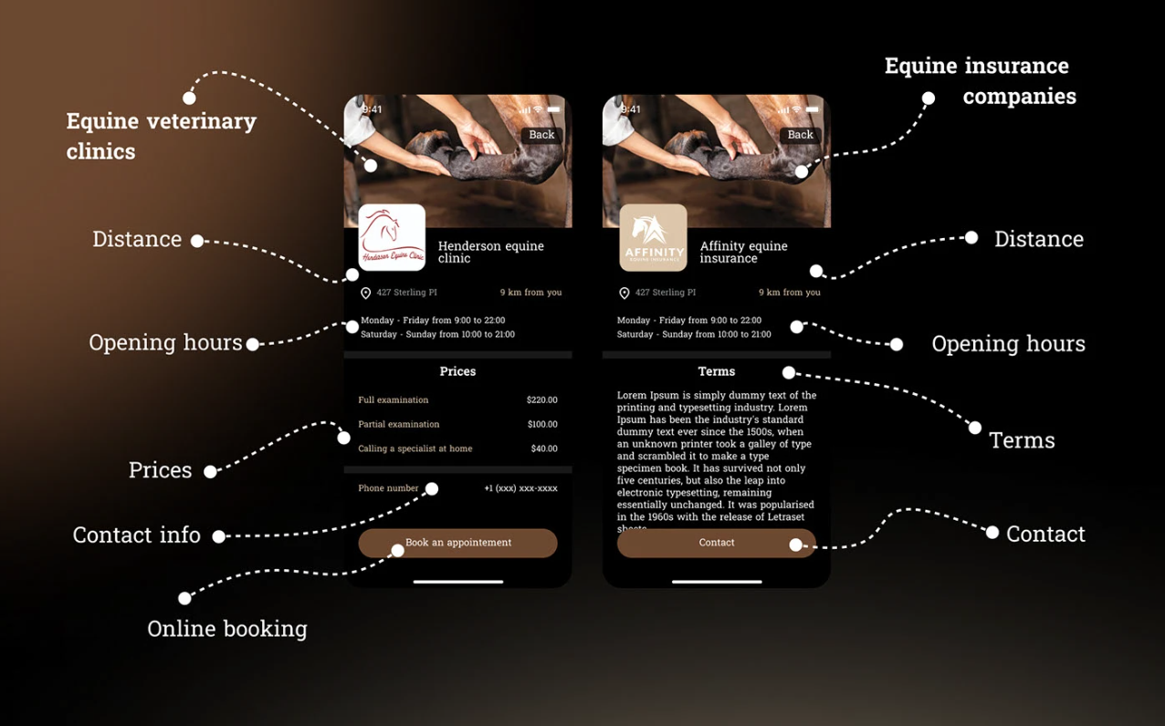
Clinic booking, kept separate. Different flow, different information — which clinic, which date, which time. Related service, different decision, so it does not get folded into the others.
Why the three-route structure is the whole answer
Everything else follows from it.
Once the app accepts that it has three users rather than one, each path can be honest about what it is. The emergency path is short because it is for someone frightened. The subscription path is a calculator because it is for someone doing arithmetic. The clinic path is a booking form because that is what it is.
The alternative — one universal flow that serves everyone adequately — would have been shorter to design and worse for all three. Most of the work in a product like this is not drawing screens. It is noticing, before you draw anything, that you are looking at three products wearing one name.
Why concept work is worth showing
A client project is shaped by budget, deadline, and someone's opinion. That is the job, and most of our portfolio is exactly that.
But it means what you see is partly a record of what was possible rather than what was right. Concept work strips that away, and what is left is the reasoning: what the designer thinks matters, what they cut, and what they will not compromise when nobody is making them.
That is what you are hiring. It is worth being able to see it.
Designed by Lali Bagrationi. Now Project Manager and Designer at DAKER.