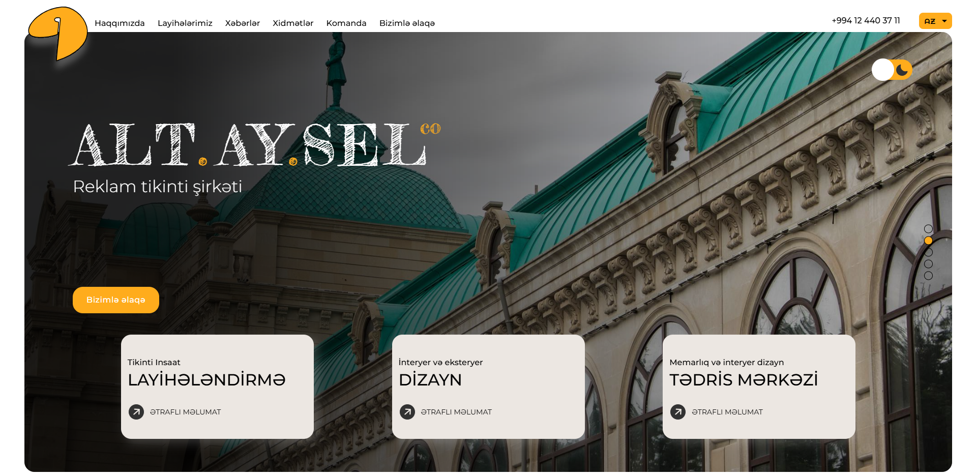
Altaysel — Website for an Architecture Firm
Altaysel is an architecture practice. They came to us for a new site, built from the ground up, that reflected who they are and loaded fast.
Simple brief. Deceptively hard category.
The problem
Architecture websites have a specific trap, and almost all of them fall into it.
The work is visual. So the site is built out of large, beautiful photographs — full-bleed images, generous scale, the projects presented at the size they deserve. Which is correct, and which is exactly what makes these sites slow. Every architecture practice on the internet has a site that looks superb and takes six seconds to appear.
That trade-off is presented as inevitable. It is not. But avoiding it is a build decision made at the beginning, not an optimisation applied at the end — and by the time anyone runs a speed test, the foundation has already decided the answer.
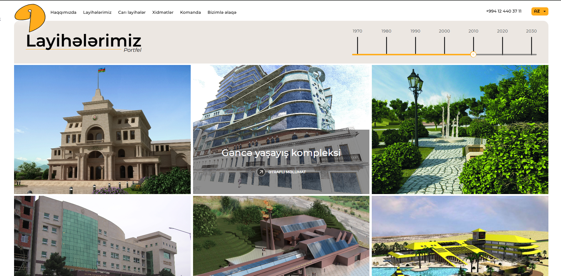
The second problem: for an architecture firm, the archive is the pitch. A visitor is not reading about your philosophy — they are looking at what you have built and deciding whether they want their thing to look like that. Everything else on the site is in the way.
What we built
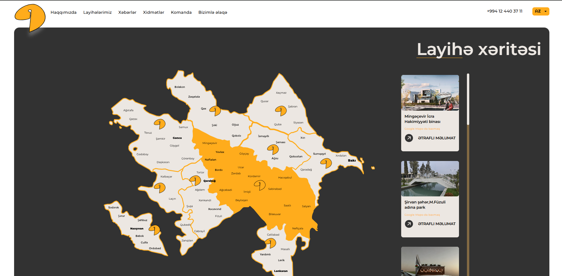
A site built around the archive. Structure, navigation and pacing designed so a visitor can move through the work without friction. The projects carry the page; nothing competes with them.
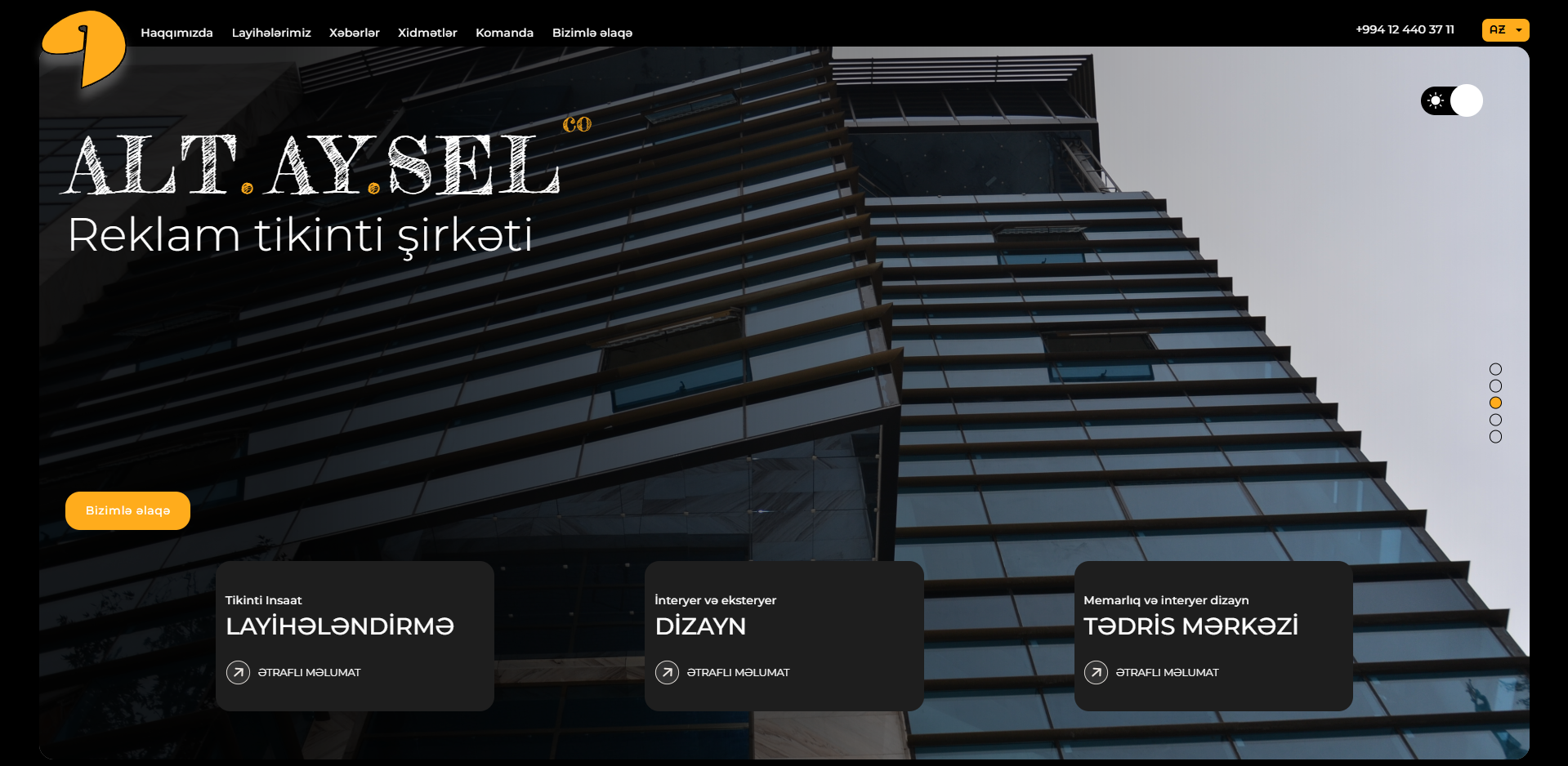
A design that reflects the practice. Not a template with their photographs dropped in — an identity that belongs to them, because a practice that sells design cannot be presented in something generic without the contradiction being visible.
Speed as a requirement, not a hope. The client asked for fast page loading in the brief, which is unusual and correct. So it was a constraint from the first decision rather than a problem to solve after the design was signed off — image handling, structure and delivery all built with the number in mind.
Working properly on a phone. People look at architecture on phones, in the evening, on a sofa. The site treats that as a primary case rather than a compressed afterthought.
Why "fast" had to be decided first
If you design a heavy site and then try to make it fast, you get a slightly less heavy site.
The weight is not usually in the images — it is in how the page is assembled, what it loads, and how much has to happen before anything appears. Those are decisions made before a single photograph is placed, and reversing them means rebuilding. It is the difference between a site that can be optimised and one that cannot.
Getting this right meant the visual ambition and the speed requirement never actually conflicted. They are only in tension when the order of decisions is wrong.
Result
A site that presents the practice's work at the scale it deserves, appears quickly, and works on the device most people will see it on — built from scratch, for them.
Built by DAKER — design, development, deployment.